Michael Pitzer (Art & Design)

Kawasaki Motorcycles

Event Marketing Print Campaign

If you aren't familiar with this campaign, it actually proved to Kawasaki the power of advertising. These ads were written about an event in the future where people would ride to these little towns, spend the day with other riders, have a beer and a hotdog, talk shop and then ride home later that evening. The copy talked about the great time they had getting there on their Kawasaki and so on. The first ads got about 50 riders to go to these places on the day these events were to have happened. The next ads got a couple hundred riders to attend. By the end of the campaign, there were a couple thousand riders showing up at these destinations. Entire support systems had to be brought in, police, security, bathrooms, you name it. Which is the number one reason the campaign was put to rest, Kawasaki couldn't afford the support structure to maintain these events at the pace they were growing.

So the guy standing next to the gas pump with the red rag in his pocket is actually Cameron Day and the guy with the curly hair sitting on the Kawasaki is me. We had really good budgets for these print ads but not enough to fly models in with us to pose for Bruce's photos which he'd create the final paintings from.

  • Kawasaki Motorcycles
  • Bozell⁄Los Angeles
  • Scott Young
  • Mel Newhoff
  • Michael Pitzer
  • Cameron Day
  • Bruce Wolfe
  • 1991 - 1992
1991 Kawasaki Print Campaign, Highland House Restaurant

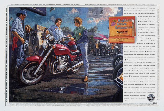
Amazingly, back in 1991, it was the view of the Senior Account Manager that a guy riding a motorcycle would ever have "4 ear rings" like the model in this ad did. If you look close you can see 'em. Cameron and I couldn't believe it, this guy actually tried to get the illustrator to paint them out of the final art.

1991 Kawasaki Print Campaign, Top Dog Cafe

There I am again standing with Bruce's wife near the wall at the flat track. I was wearing a lamb-skin leather jacket. A word of advice, mud does not come out of lamb-skin.

1991 Kawasaki Print Campaign, Flat Track Racing

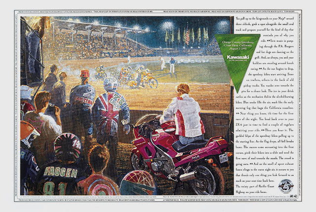
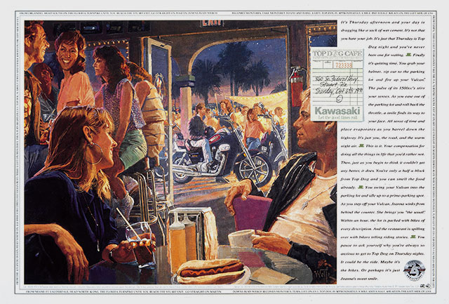
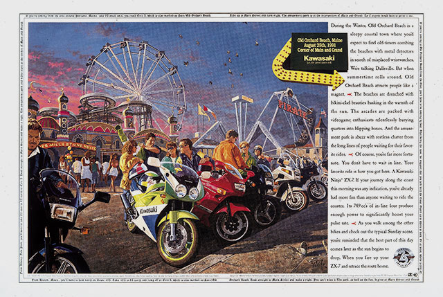
One of the cool things Cameron and I did was build directions on how to get to these events in the borders of the print ads. Cameron wrote the top as though you were coming from the North, the bottom as though you'd be riding from the South and the left side was West and the right border was directions from the East.

1991 Kawasaki Print Campaign, Old Orchard Beach

We also tried to find the right type font for each ad hoping to reflect more on the image of the event than the brand of Kawasaki. My mistake to do so. At that time there just weren't many great type fonts on desktop computers and I think I really hurt the overall art direction trying to work with what the agency did have – basically crap.