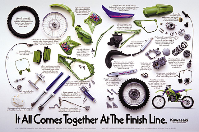
The ad above was created in one shot for all of the parts and one stripped in inset for the KX. The main shot was taken using an 8x10 camera by Mark McIntyre. We rented the tallest photo studio in Los Angeles and removed one of the large air vents on the roof to shoot through. Using walkie-talkies and string, we laid out the disassembled bike to the exact specification of the magazine using the string to map out bleed, live and trim as well as gutter specs.
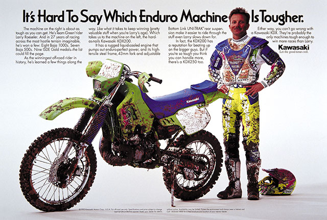
In this ad, featuring an extremely dirty KDX200 and even muddier Larry Roeseler, this was the first time Kawasaki ever allowed an ad to run without a traditional "beauty shot" of their featured motorcycle.
We also tried to find the right type font for each ad hoping to reflect more on the image of the event than the brand of Kawasaki. My mistake to do so. At that time there just weren't many great type fonts on desktop computers and I think I really hurt the overall art direction trying to work with what the agency did have — basically crap.