The ads below represent a new direction I had created that used the thickness of the EECU logo to create ribbon art that could be morphed into different shapes and images that would then be used in print, online and in TV. The visual inspiration actually came from the rhythmic gymnastic and the synchronized ribbon twirling in the Olympics. And as the campaign would run during the the 2012 Olympics, it made perfect sense to build a brand image for EECU that could transcend the Olympic games.
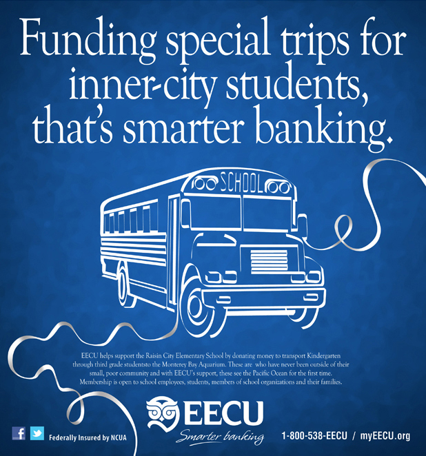
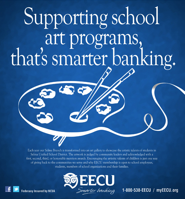
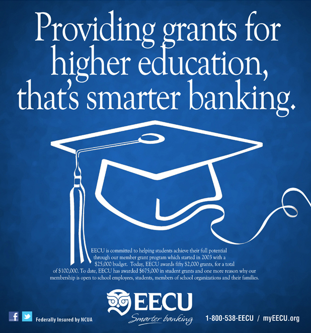
The campaign also included a three-sided rotation billboard in Fresno, two :30 TV spots and six :15 spots that were lifted from both :30′s, numerous online and Flash banners, direct mail, in-branch posters and radio. This campaign also gave me the opportunity to finally address the fact the new tagline "Smarter Banking", which Jim Huff and I had created and subtly introduced it into the EECU marketing and branding, but no true campaign had been created to explain the benefits and differences of what "smarter banking" was or what it meant to the EECU customer. The set up for that campaign came form this campaign and the line structure, (something EECU does or offers, with the wrap-up line "That's smarter banking.") This is also a direction Kathleen Goble, the Account Executive at Catalyst Marketing Company worked diligently on before leaving the agency.